A watermark is read by two people whose interests are opposed. One is the customer about to buy, who wants an unobstructed look at the product. The other is whoever reposts your photo somewhere else, from whom you want your name to be legible even after a screenshot and a resize.
Every setting below is a trade between those two readers. Here is where the line usually falls, and which control moves it.
Opacity: the single most important number
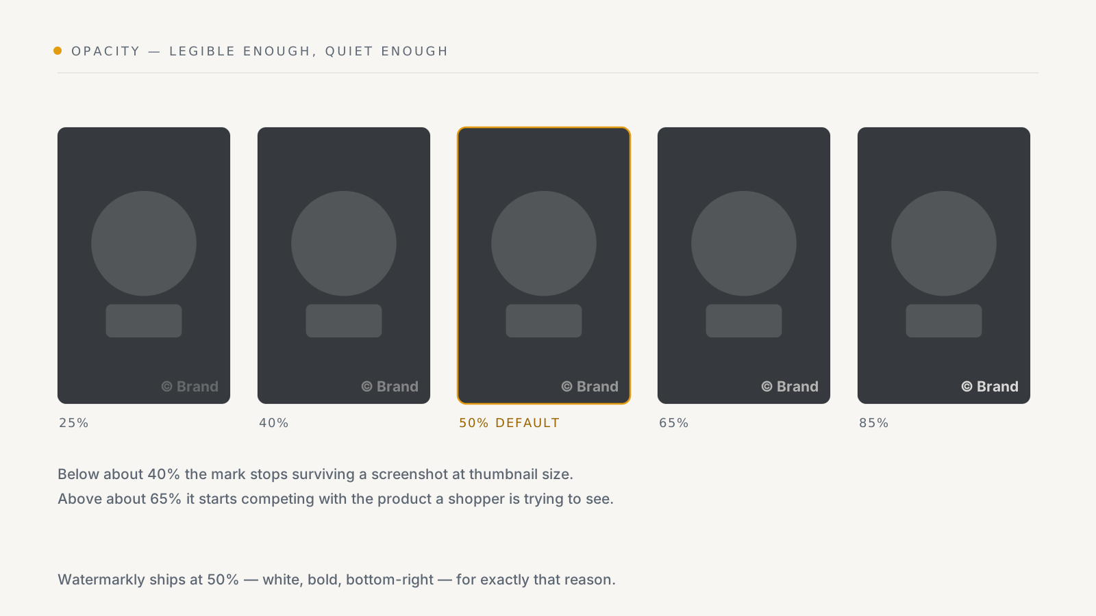
Watermarkly ships at 50%, and that is a good place to stay for a corner mark. The useful range is narrow:
- Below ~40% the mark survives a full-size view but disappears once the image is screenshotted, resized to a 400px grid tile, or re-compressed by a social platform. A watermark nobody can read in the copy is decoration.
- Above ~65% it starts reading as damage to the photo rather than a signature, and it is the first thing a shopper notices instead of the product.
Two adjustments beat lowering opacity when a mark feels intrusive: move it somewhere emptier, or make it smaller. Both keep it legible in a copy; dropping opacity does not.
One exception: if you are tiling (below), go lower — around 25–35%. A tile covers the whole image, so the same opacity that reads as a discreet signature in a corner reads as a wall across the product.
Placement: pick your compromise deliberately
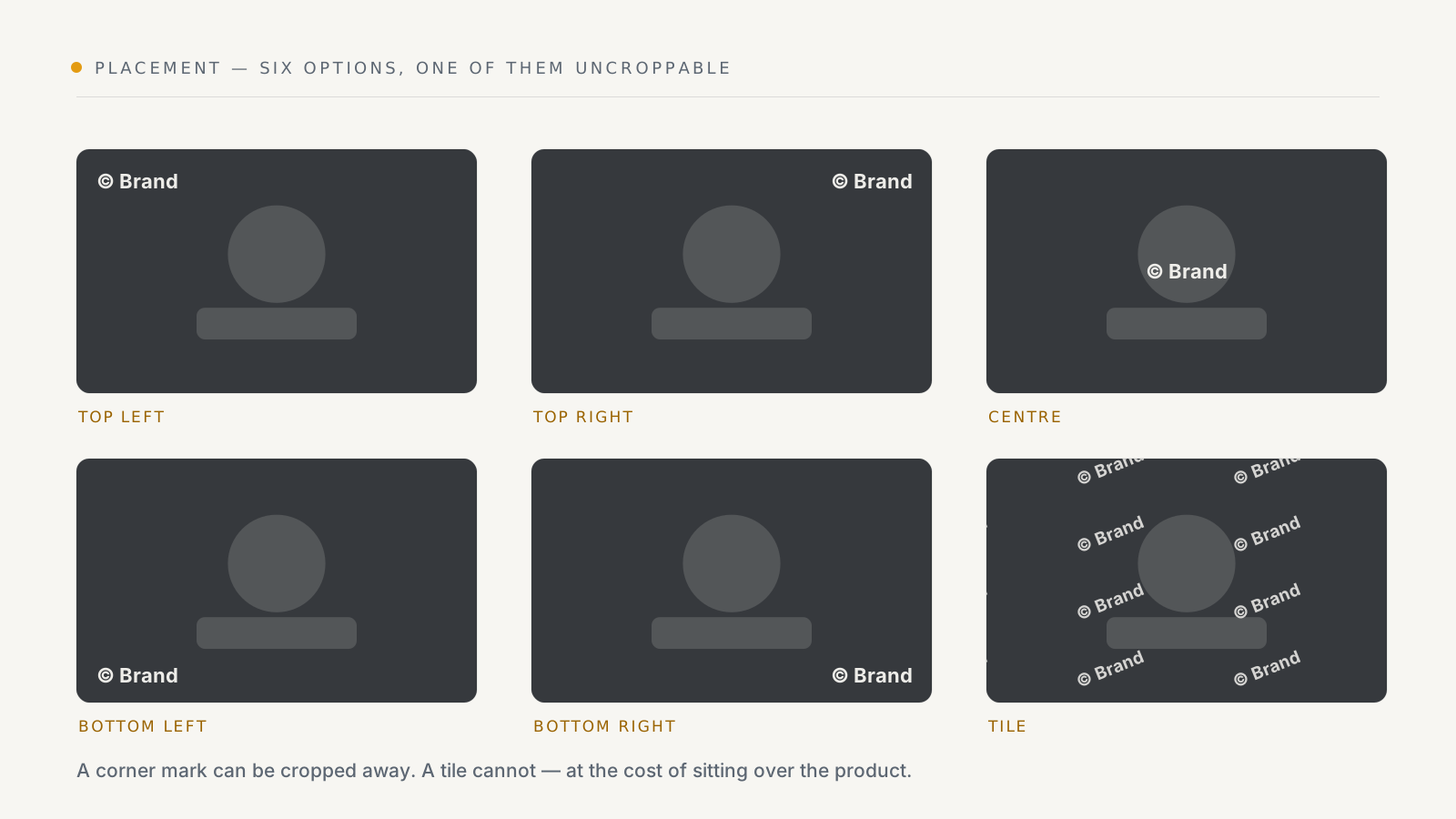
There are six placements, and the real choice is only between two strategies.
A corner — least intrusive, and croppable. Anyone can cut 15% off an edge and your mark is gone. This is the right default, because most image theft is lazy: a right-click save and an upload, not an edit.
Tile — repeated diagonally across the whole image. Cannot be cropped out, cannot be cloned out easily, and is visible on your own product page to every customer. Reach for it when you have evidence your photography is being taken and edited, on the specific products where it is happening, rather than across a whole catalogue.
Centre sits between the two and is usually the worst of both: it lands on the product and is still croppable. It is there for the cases where the subject is genuinely at the edge of the frame.
Two controls fine-tune whichever you pick:
- Margin X and Y push the mark away from the edge. Raise them if your photography has product bleeding into the corners, or if the storefront crops your images to square.
- Rotation tilts the mark. A few degrees makes it marginally harder to remove automatically. Past about 15° it starts looking like a mistake.
A practical note: bottom-right lands on the product in a great many packshots, because that is where the subject's shadow falls. Check two or three genuinely different photos before committing, not just the one you had open.
Size
Size is set two ways depending on what the mark is. Text takes a font size in pixels — the default is 48, which suits images around 1000–2000px on the long edge. Logos take a scale percentage, defaulting to 20% of the image, so one setting stays proportionate across a catalogue of mixed image dimensions.
Either way, judge it at the size customers see. A mark sized on a 2000px source image can be illegible in a 400px collection tile — and the collection tile is where most people first see the photo.
Typeface
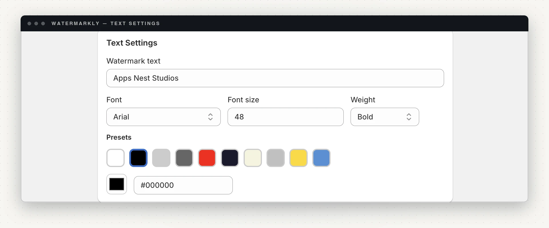
Ten families are offered: Arial, Helvetica, Times New Roman, Courier New, Verdana, Arial Narrow, Roboto, Open Sans, Montserrat and Inter, in normal or bold.
That list is short on purpose, and the reason is worth knowing because it affects what you get. The watermark is composited on the server, not in your browser. The preview can load any webfont it likes; the server can only draw a face it actually has installed. When those two disagree, you pick an elegant script in the preview and get plain sans-serif burned into every product image — and the only fix is a full undo and a re-run, which costs your monthly allowance twice.
So the picker only lists faces the server genuinely renders, and the preview uses the same font stack the server does. If you previously chose a family that is no longer offered, it is mapped to the closest installed face and the app tells you which — a substitution you can see, rather than one that happens silently in your catalogue.
For the mark itself: bold, and wide. A watermark is read at small sizes, against unpredictable backgrounds, through JPEG compression. Arial, Helvetica, Verdana, Roboto, Open Sans and Inter all hold up. Arial Narrow is useful when the text is long — a full store name rather than a symbol. Courier New and Times New Roman have character but lose legibility first when the image is compressed.
Colour
Ten presets — white, black, light grey, dark grey, red, navy, beige, silver, gold and blue — plus a hex field for an exact brand colour.
White is the default and the right one for most catalogues, because it stays readable on mid-tone and dark photography and reads as a signature rather than a label. Black works on consistently bright, high-key product shots. Everything else is a brand decision that costs you legibility on some part of your catalogue.
The reason to resist an exact brand colour: a watermark has to work on every photo you have, including the one with a background the same shade as your brand. Neutral survives that; a brand colour has to be checked image by image.
Text or logo
Text is on every plan, and it is the more robust choice — it stays legible
much further down in size, and you can change it without re-uploading anything.
The default is © Your Brand; your store name or domain both work well, and a
domain has the advantage of telling someone where to buy the thing they are
looking at.
A logo is available from the Starter plan, uploaded as PNG, JPEG, SVG or WebP. It is more recognisable at a glance and more on-brand. Use a version with transparency and enough contrast to survive at 20% scale — a detailed logo with fine strokes turns into a grey smear at watermark size. If yours does, use a simplified mark or the wordmark alone.
A starting recipe
For a typical catalogue, this is a defensible starting point:
- Text: your domain, e.g.
yourstore.com - Font: Arial or Inter, bold, 48px
- Colour: white
- Position: bottom-left (it collides with the product less often than bottom-right), margins 20/20
- Opacity: 50%
- Rotation: 0
Apply it to one product, look at that product on the live storefront on a phone and in a collection grid, adjust, re-apply. Then roll it out — how to bulk watermark a whole Shopify catalogue covers limits, failures and a safe order of operations.
And keep the expectation right: a well-set watermark does not prevent theft. It makes the theft carry your name. If you also want to close the two easiest routes to taking the image in the first place, that is right-click protection — a separate, partial measure that belongs on top of the watermark, never instead of it.
Every setting in this guide is on the Free plan except the logo watermark: Watermarkly on the Shopify App Store. Set the mark, apply it to one product, and judge it on your own photography before you commit a catalogue.